SOLE Effects
Brand identity and creative direction for non profit organization, SOLE Effects.
PROJECT DESCRIPTION
SOLE Effects is an award winning non profit organization located in Southern California that empowers students with leadership skills. Founded by two educators who saw increasing rates of suicide and mental health issues amongst young students, SOLE Effects was created to teach youth how to effectively deal with life’s hardships and develop skills to make resilient, successful, purpose-driven human beings. Established in 2015, the company needed an updated identity and direction. The organization needed an established brand identity that was consistent across digital presence, marketing and program materials. The goal was to create a brand that felt engaging and inclusive for all students while maintaining a professional image that is well received by potential donors, council and board members.
We partnered with SOLE Effects in 2020 designing a refreshed brand identity and have been working together ever since. Our work has ranged from program and material design, marketing graphics, social media direction, content creation, website design and presentation design.
Acquired by AVID in 2023
ROLE
Creative Director + Art Direction
KEYWORDS
Brand Identity + Strategy • Creative Direction • Marketing • Social Media • Web Design • Program Design • Editorial
CREDITS
Karen Ogden, Paula Zimmerman, Danielle Reyes, Jordyn Wong, Natalie Mayoral, Rachel Betteker
Brand Voice
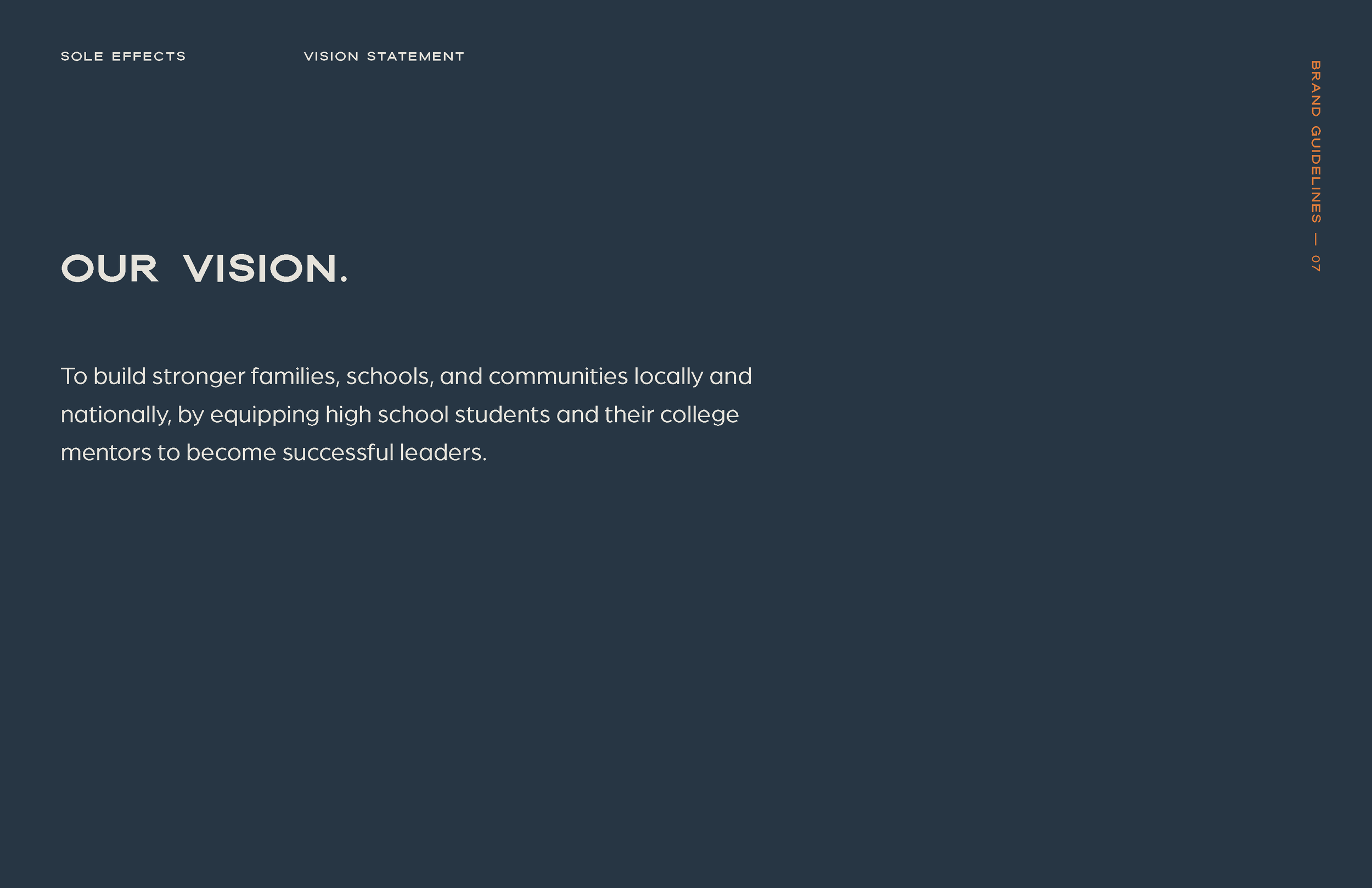
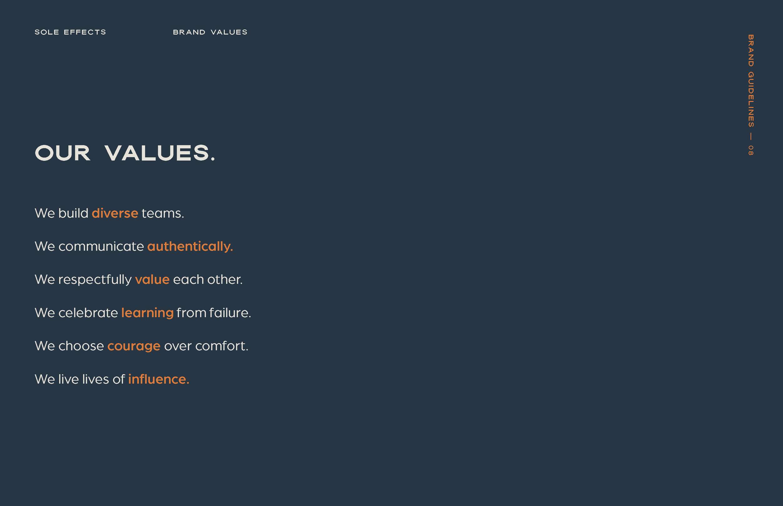
Working with the client to establish a clear brand voice and creative direction. We developed a brand mission, elevator pitch, keywords, vision, values, and purpose. This foundational framework creates a strong tone for the brand and helps to align on values prior to any design work.



SOLE Effects: Adventure Program
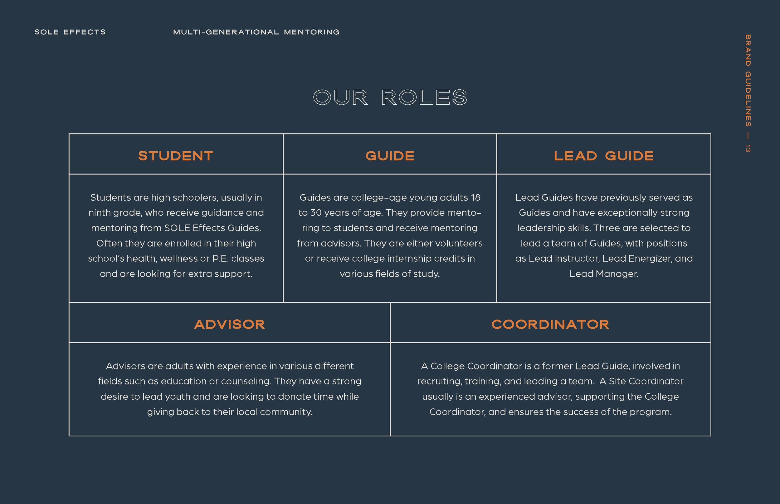
The Adventure Program is SOLE Effects' MVP and has been carefully crafted to address the issues of students of all backgrounds, beliefs and affiliations. It is designed for all students with all levels of social and emotional skills. We redefined roles and added descriptions for both current and future team members.

Archetypes + Personas
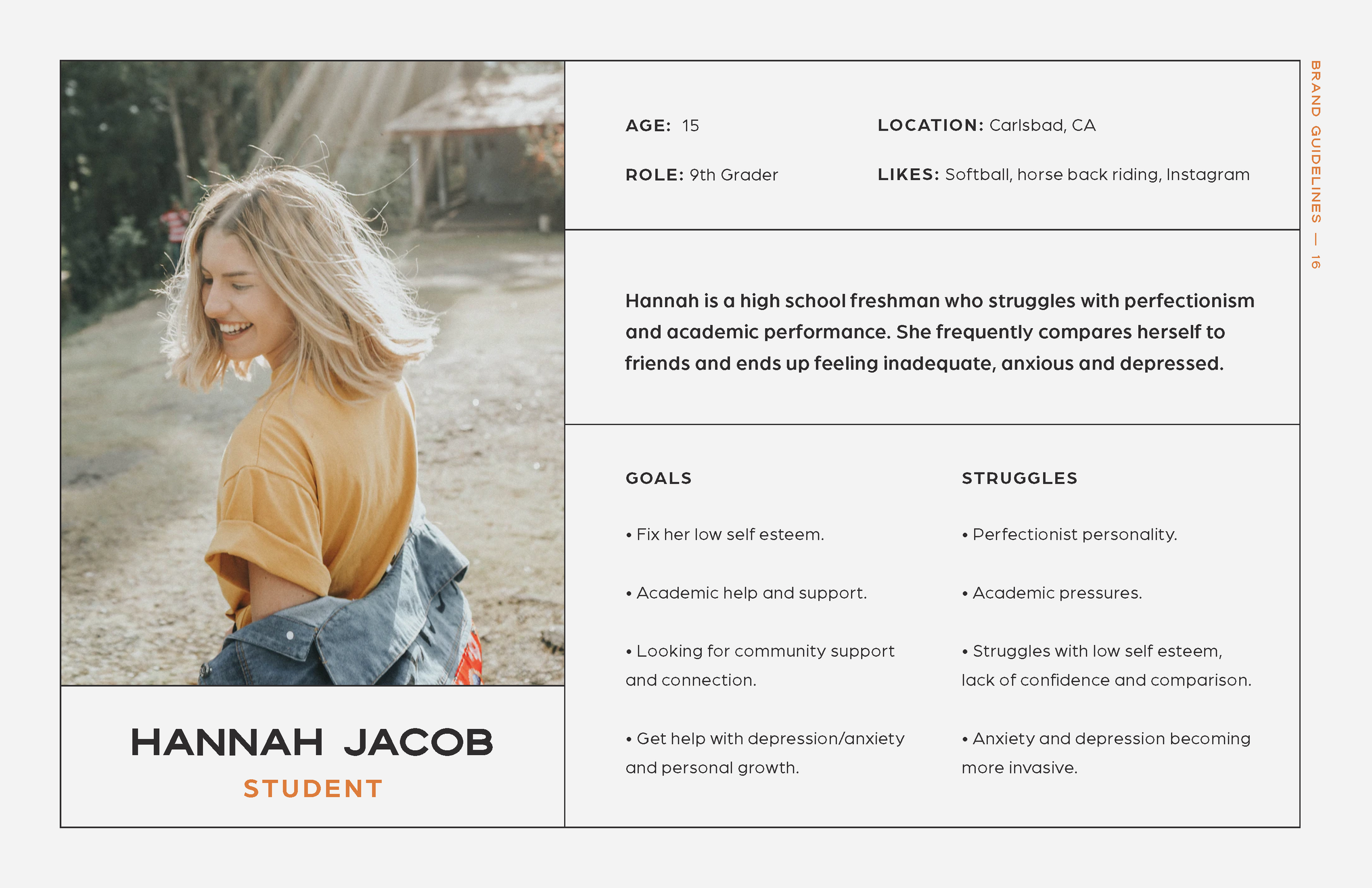
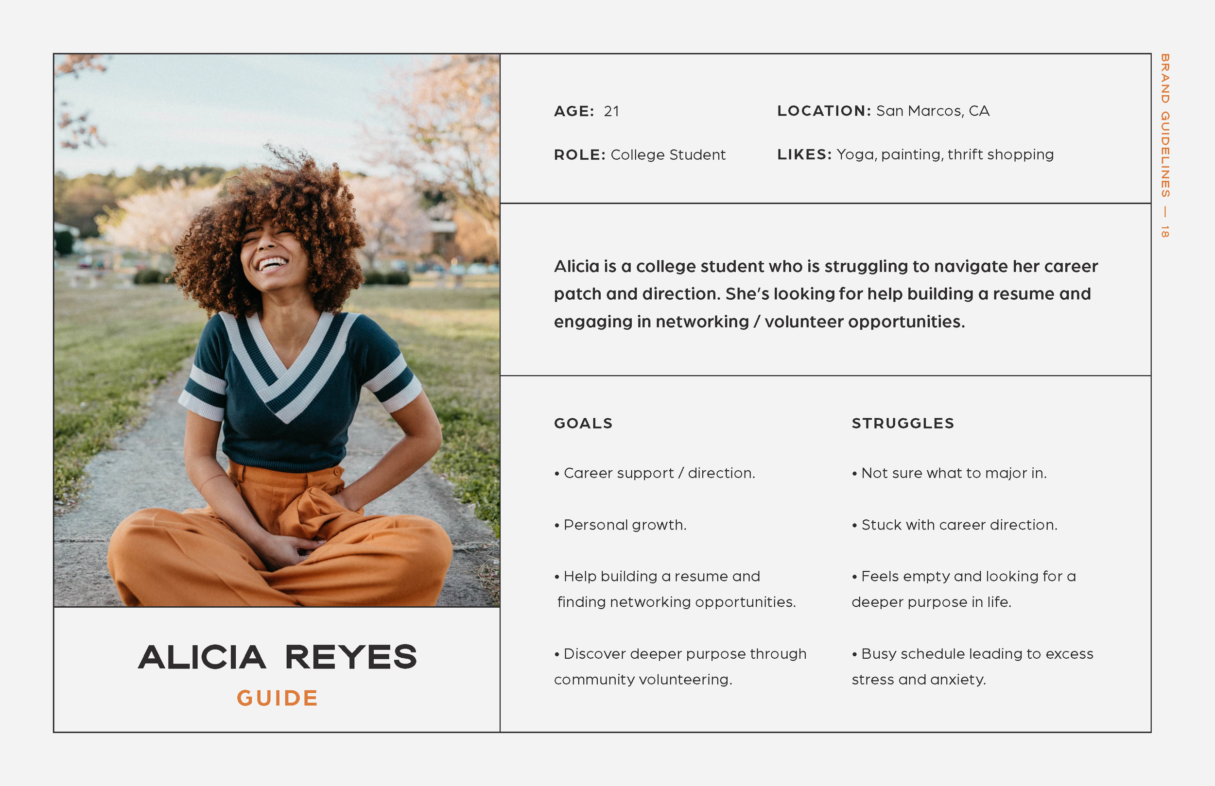
We conducted consumer demographic studies to analyze and understand the target audiences, ultimately gaining insight into developing a creative approach that resonates with the desired user. Study of real-life archetypes and team members to influence brand identity, structure and strategy.
Students
Guides
Advisors


Mood board
It was important to pull images that represented adventure, exploration, and community. The client loved the compass that appeared in the current brand identity and wanted to keep that consistent. Adding more relatable imagery and graphic inspirations to appeal to all audiences of SOLE Effects.
Adventurous
Supportive
Purpose-driven
Typography
Color Theory
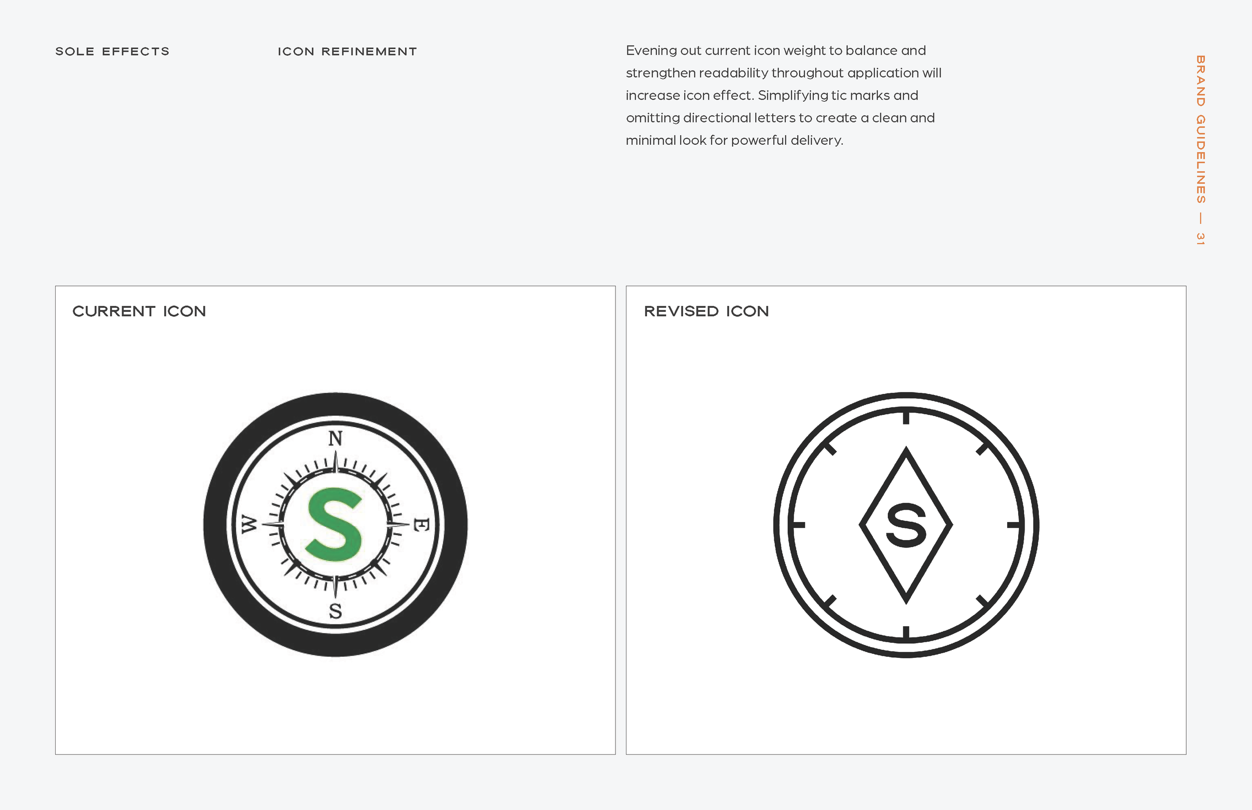
Icon Refinement
Taking pieces from the current compass icon to recreate a balanced, strong, and readable mark that is easily applied on various applications. Simplifying tic marks and omitting directional symbols to create a clean and minimal look for powerful delivery.
Modernize
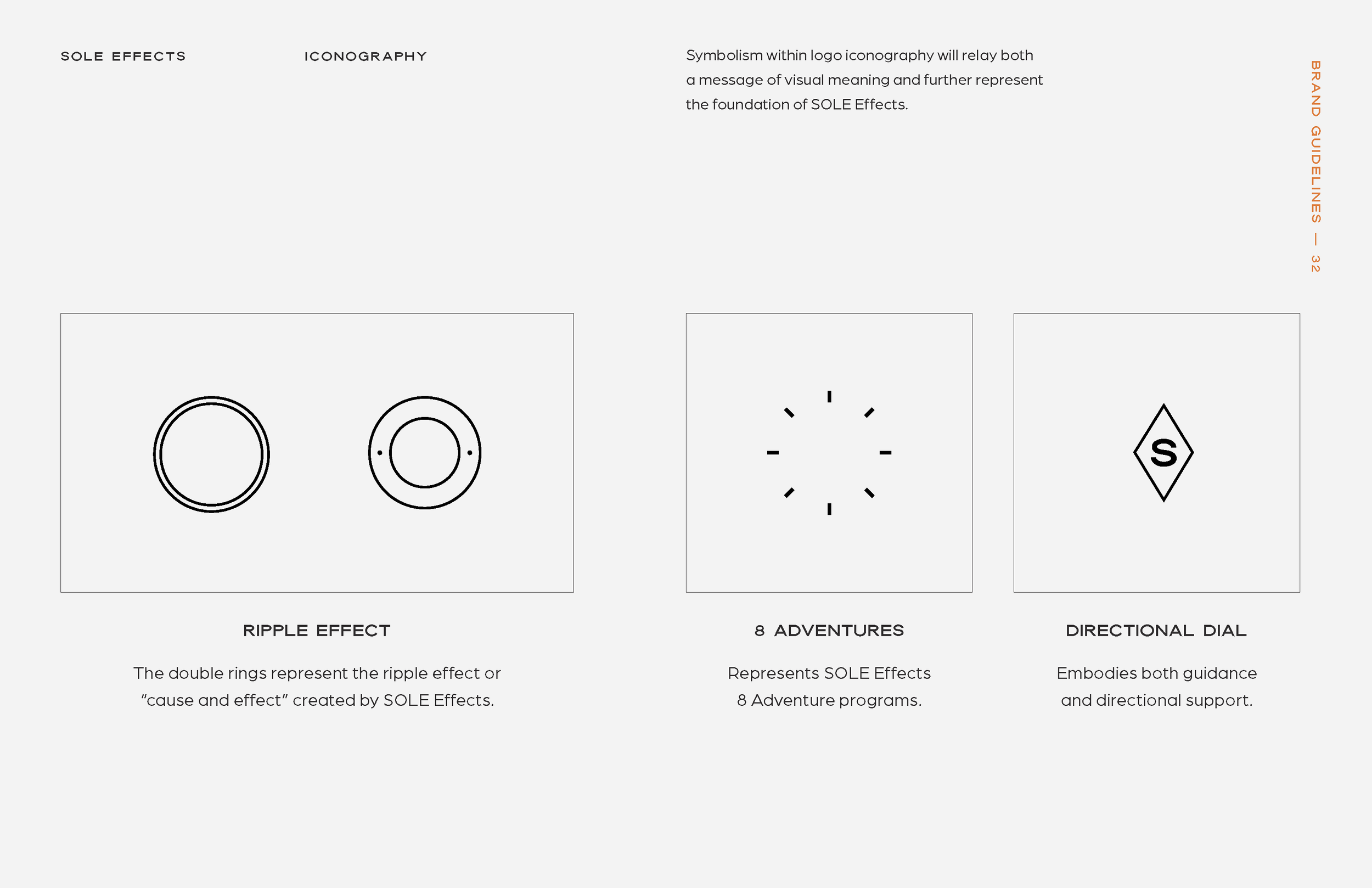
Highlight 8 Adventures
Easily applicable


